Orangelabel.com »

Logos

»

Pervy Med pharmacies

Task
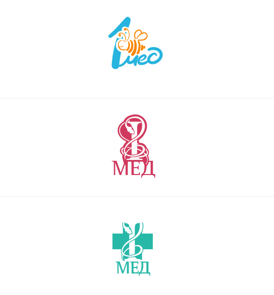
Design a logo for the "Pervy Med" pharmacy chain. One of the client's wishes was to have a bee on the logo, since their pharmacies are often called "Pervy Myod" ("First Honey").

A series of logo options for the «Pervy Med» pharmacies.


In the end, the client chose the logo with the bee.

Client
«Pervy Med» pharmacies

Project manager
Alexander Martynenko

Art director
Denis Protsenko

Designer
Daria Lobunets

Scope of work
Logo design.

Delivered
25.11.2005